[et_pb_section admin_label=”section”][et_pb_row admin_label=”row”][et_pb_column type=”4_4″][et_pb_text admin_label=”Text” background_layout=”light” text_orientation=”left” use_border_color=”off” border_color=”#ffffff” border_style=”solid”]
Flutter navigation drawer:
Navigation Drawer is a kind of menu which is quite common in apps, which makes the user understand the key features of the app much easier.
We also find a user profile in this menu which makes the user know his details with a profile pic in some cases.
So, today we deal with flutter navigation drawer in both Android as well as iOS using the flutter.
Please visit my previous tutorials on flutter for more info on this topic because you will understand this concept much better if you go through the previous blogs which deal with flutter basics.
Let’s start coding, the flutter navigation drawer with the basic components
Flutter Navigation Drawer
Main.dart
Import flutter package
'package:flutter/material.dart';
Declare a void main
void main() => runApp(MyApp());
Now create a class MyApp which extends StatelessWidget
class MyApp extends StatelessWidget {
  @override
  Widget build(BuildContext context) {
    // TODO: implement build
    return MaterialApp(
      title: "MyApp",
      home: Scaffold(
          appBar: AppBar(
            title: Text("MyApp"),
            backgroundColor: Colors.lightGreen,
          ),

          backgroundColor: Colors.white,

      ));
  }
Now add in body add text view just to display a sample text
body: Center(
  child: Text("Navigation Drawer",
      style: TextStyle(
          color: Colors.deepOrange,
          fontSize: 25,
          fontStyle: FontStyle.italic)),
),
then add a navigation drawer
drawer: Drawer(
   )),
add a list view inside drawer
child: ListView(
)
padding for list
padding: EdgeInsets.only(),
add a drawer header
children: <Widget>[
  DrawerHeader(

  ),
a sample text where we display user information in further stages, which include background color for header, and text color, font size declaration.
DrawerHeader(
  child: Text(
    'Welcome Abhi',
    style: TextStyle(
      color: Colors.white,
      fontSize: 20,
    ),
    textAlign: TextAlign.right
  ),
  decoration: BoxDecoration(
    color: Colors.lightGreen,
  ),
  padding: EdgeInsets.all(20),
),
now here come’s the key module that is adding a row to list view
we declare name of the tile with the properties like font size, color etc.,
ListTile(
  title: Text('Home',
      style: TextStyle(
        color: Colors.black,
        fontSize: 18,
      )),
  contentPadding: EdgeInsets.fromLTRB(20, 5, 0, 5),
),
and we need a click functionality for which we have a method called — tap()
onTap: () {
},
like wise add few more fields depending on your requirement you can also specify the sections in the list view to further categorize.
Full code:
Providing the full source code for flutter navigation drawer implementation.
import 'package:flutter/material.dart';

void main() => runApp(MyApp());

class MyApp extends StatelessWidget {
  @override
  Widget build(BuildContext context) {
    // TODO: implement build
    return MaterialApp(
      title: "MyApp",
      home: Scaffold(
          appBar: AppBar(
            title: Text("MyApp"),
            backgroundColor: Colors.lightGreen,
          ),
          body: Center(
            child: Text("Navigation Drawer",
                style: TextStyle(
                  color: Colors.deepOrange,
                  fontSize: 25,
                  fontStyle: FontStyle.italic
                )),
          ),
          backgroundColor: Colors.white,
          drawer: Drawer(

            child: ListView(
              padding: EdgeInsets.only(),

              children: <Widget>[
                DrawerHeader(
                  child: Text(
                    'Welcome Abhi',
                    style: TextStyle(
                      color: Colors.white,
                      fontSize: 20,
                    ),
                    textAlign: TextAlign.right
                  ),
                  decoration: BoxDecoration(
                    color: Colors.lightGreen,
                  ),
                  padding: EdgeInsets.all(20),
                ),
                ListTile(
                  title: Text('Home',
                      style: TextStyle(
                        color: Colors.black,
                        fontSize: 18,
                      )),
                  contentPadding: EdgeInsets.fromLTRB(20, 5, 0, 5),
                  onTap: () {

                  },
                ),
                ListTile(
                  title: Text('Profile',
                      style: TextStyle(
                        color: Colors.black,
                        fontSize: 18,
                      )),
                  contentPadding: EdgeInsets.fromLTRB(20, 5, 0, 5),
                  onTap: () {

                  },
                ),
                ListTile(
                  title: Text('Settings',
                      style: TextStyle(
                        color: Colors.black,
                        fontSize: 18,
                      )),
                  contentPadding: EdgeInsets.fromLTRB(20, 5, 0, 5),
                  onTap: () {

                  },
                ),
                ListTile(
                  title: Text('Logout',
                  style: TextStyle(
                    color: Colors.black,
                        fontSize: 18
                  ),),
                  contentPadding: EdgeInsets.fromLTRB(20, 5, 0, 5),
                  onTap: () {

                  },
                )
              ],
            ),
          )),
    );
  }

}
[/et_pb_text][et_pb_text admin_label=”Text” background_layout=”light” text_orientation=”left” use_border_color=”off” border_color=”#ffffff” border_style=”solid”]
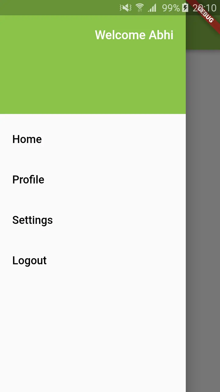
Output:
This screen depicts flutter navigation drawer implementation in flutter app.


If you have any queries in this tutorial on flutter navigation drawer do let us know in comment section below also do like share this tutorial for more interesting updates.
[/et_pb_text][/et_pb_column][/et_pb_row][/et_pb_section]
