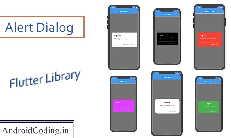
Flutter alert box, Flutter a new way to program has been optimizing the way you code individually for android and ios a single code base for two platforms making the code efficiency and maintaining time constraints in project development.
Recently uploaded a library based on flutter alert box and this tutorial deals with the usage of library for creating alert-dialog.
Flutter alert box
Let us start flutter alert box library implementation by creating a flutter project.
Create a class extending stateless widget.
class MyApp extends StatelessWidget {
  @override
  Widget build(BuildContext context) {
    // TODO: implement build
    return MaterialApp(
      home: Scaffold(
        appBar: AppBar(
          title: Text('Alert Dialog'),
        ),
        body: App(),
      ),
    );
  }
}
Now create a class extending stateful widget
class App extends StatefulWidget {
  @override
  AppState createState() => new AppState();
}
Dependency:
Add dependency in pubspec.yaml
abhi_flutter_alertdialog: [latest version]
Usage:
Alert dialog can be customized using the parameters available
Content Parameters :
These parameters are the basic parameter used to display details of the flutter alert box.
– Title : String format title to be displayed.
– Content : String format content to be displayed.
– action1 : Button 1 text to be displayed.
– action2 : Button 2 text to be displayed.
Functional Parameters:
These parameters are used to perform action on the button clicks. You need to pass the function to the parameter so that the operation is performed on button click.
– function1 : This is the function to be performed on first button click.
– function2 : This is the function to be performed on second button click.
Design Parameters:
These parameters are used to customize design changes to the alert dialog.
– div : Add a divider line in the dialog above buttons.
– txtAlign : Align the text to left, center and right using this key.
– left : 1
– center : 2
– right : 3
– radius : Radius of the alert box can be specified in double format.
– boxColor : Box background color can be specified.
– btnTxtColor : Button text color can be specified.
– txtColor : Title, Content text color is specified.
main.dart
Providing the code for implementation of flutter alert box.
import 'package:flutter/material.dart';
import 'package:flutter_alertdialog/alertdialog.dart';

void main() => runApp(MyApp());

class MyApp extends StatelessWidget {
  @override
  Widget build(BuildContext context) {
    // TODO: implement build
    return MaterialApp(
      home: Scaffold(
        appBar: AppBar(
          title: Text('Alert Dialog'),
        ),
        body: App(),
      ),
    );
  }
}

class App extends StatefulWidget {
  @override
  AppState createState() => new AppState();
}

class AppState extends State<App> {
  @override
  Widget build(BuildContext context) {
    // TODO: implement build
    return Scaffold(
        body: Container(
      child: Column(
        children: <Widget>[
          Center(
            child: RaisedButton(
                child: const Text('Alert'),
                onPressed: () => showDialog(
                      context: context,
                      builder: (context) => AlertDialog1(
                        context: context,
                        title: 'Logout',
                        content: 'Are you sure you want to exit!!!',
                        action1: 'cancel',
                        action2: 'yes',
                        function1: () => functionA(),
                        function2: () => functionB(context),
                        div: false,
                        txtAlign: 2,
                        radius: 0.0,
                        boxColor: Colors.green,
                        btnTxtColor: Colors.white,
                        txtColor: Colors.white,
                      ),
                    )
            ),
          )


        ],
      ),
    ));
  }

  functionA() {
    print('Yes');
  }

  functionB(BuildContext context) {
    Navigator.pop(context);
  }
}
Output :
This screen below depicts the flutter alert box library usage


If you have any query in this tutorial i.e., flutter alert box library implementation do let us know in the comment section below, do like share this tutorial for more interesting updates.
