Flutter Circular Progress Indicator :
Flutter circular progress bar is used to pictorially represent the status of the work done and remaining further.It may also contain the time elapsed.
It’s a common component we see in the apps when there is a background task going on we display a progress bar so that user can know the status of the work.
Also we can observe these flutter circular progress indicator in drag to refresh components too where we can refresh the view and mean while show circular progress bar.
In general when app load we can find these progress bars, so in this tutorial we will see the usage and implementation.
Flutter Circular Progress Indicator :
Go through the below tutorial for more information on implementation.
Project Structure :
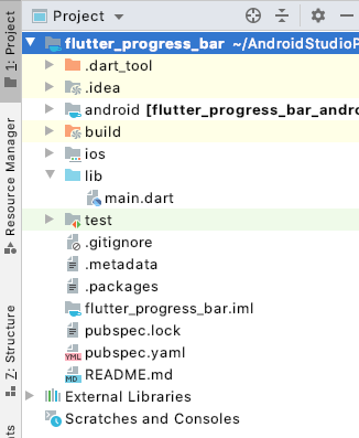
This image depicts the project structure of flutter circular progress indicator implementation.

pubspec.yaml :
Add a percentage indicator plugin and specify the version according to the latest available.
dependencies:
  flutter:
    sdk: flutter
  percent_indicator: ^2.1.5
main.dart :
Initiate the program with void main() and consider the default class MyApp().
void main() {
  runApp(MyApp());
}
Create a StatefulWidget
class MyHomePage extends StatefulWidget {
  MyHomePage({Key key, this.title}) : super(key: key);

  final String title;

  @override
  _MyHomePageState createState() => _MyHomePageState();
}
Add a Circular Progress Indicator with different parameters like
Radius : Representing the size of the circle.
lineWidth : The width of the circle.
percent : Percentage of the circle to be filled as completed.
header : Status to be represented.
center : A icon or any widget can be shown regarding the task to be completed and its design parameter can be altered.
backgroundColor : The back ground color to be displayed.
progressColor : The color of the circle can also be provided in this parameter.
CircularPercentIndicator(
  radius: 100.0,
  lineWidth: 10.0,
  percent: 0.8,
  header: new Text("Downloading..."),
  center: new Icon(
    Icons.file_download,
    size: 50.0,
    color: Colors.blue,
  ),
  backgroundColor: Colors.grey,
  progressColor: Colors.blue,
),
CircularPercentIndicator(
  radius: 180.0,
  lineWidth: 13.0,
  animation: true,
  percent: 0.5,
  center: new Text(
    "50.0%",
    style:
    new TextStyle(fontWeight: FontWeight.bold, fontSize: 30.0),
  ),
  footer: new Text(
    "Loading...",
    style:
    new TextStyle(fontWeight: FontWeight.bold, fontSize: 25.0),
  ),
  circularStrokeCap: CircularStrokeCap.round,
  progressColor: Colors.black,
),
Flutter circular progress full code :
Providing the full code for flutter circular progress indicator implementation.
import 'package:flutter/material.dart';
import 'package:percent_indicator/circular_percent_indicator.dart';

void main() {
  runApp(MyApp());
}

class MyApp extends StatelessWidget {

  @override
  Widget build(BuildContext context) {
    return MaterialApp(
      title: 'Circular Progress',
      theme: ThemeData(
        primarySwatch: Colors.blue,
      ),
      home: MyHomePage(title: 'Circular Progress'),
    );
  }
}

class MyHomePage extends StatefulWidget {
  MyHomePage({Key key, this.title}) : super(key: key);

  final String title;

  @override
  _MyHomePageState createState() => _MyHomePageState();
}

class _MyHomePageState extends State<MyHomePage> {

  @override
  Widget build(BuildContext context) {

    return Scaffold(
      appBar: AppBar(

        title: Text(widget.title),
      ),
      body: Center(

        child: Column(

          mainAxisAlignment: MainAxisAlignment.center,
          children: <Widget>[

            CircularPercentIndicator(
              radius: 100.0,
              lineWidth: 10.0,
              percent: 0.8,
              header: new Text("Downloading..."),
              center: new Icon(
                Icons.file_download,
                size: 50.0,
                color: Colors.blue,
              ),
              backgroundColor: Colors.grey,
              progressColor: Colors.blue,
            ),

            Padding(
              padding: EdgeInsets.all(40.0),
            ),

            CircularPercentIndicator(
              radius: 180.0,
              lineWidth: 13.0,
              animation: true,
              percent: 0.5,
              center: new Text(
                "50.0%",
                style:
                new TextStyle(fontWeight: FontWeight.bold, fontSize: 30.0),
              ),
              footer: new Text(
                "Loading...",
                style:
                new TextStyle(fontWeight: FontWeight.bold, fontSize: 25.0),
              ),
              circularStrokeCap: CircularStrokeCap.round,
              progressColor: Colors.black,
            ),

          ],
        ),
      ),
    );
  }
}
Flutter circular progress output :
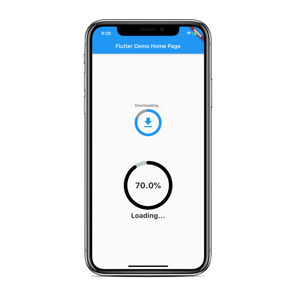
This screen depicts the usage of the flutter circular progress indicator in two variants you can customize according to your requirements.

If you have any queries on flutter circular progress indicator do let us know in comment section below.And if you like this tutorial do like, share for more interesting tutorials.
