Flutter Chips :
Flutter Chips are used to display the attributes related to user info also we can show the filter options, contacts and more using these chips.
When user selects any option out of the available we can display the selections using chips so that if user need not require it any more can remove them by clicking on the cross icon in chip.
These chips can also be further customized and provided with images, icons so that they appear more easily for the user to choose.
You can find these chips used in most of the application like youtube, amazon, flipkart as part of tags, keywords and so on.. depending upon the requirement.
Now let’s start our tutorial where we will see the basic implementation and usage of flutter chips.
Flutter Chips Video Tutorial :
Go through the below tutorial for more details on implementation.
main.dart :
Initialize with void main()
void main() => runApp(MyApp());
Here we are considering the default class MyApp()
Declare the MaterialApp with the title and declare Scaffold inside which we are providing a AppBar with a title.
MaterialApp(
  home: Scaffold(
    appBar: AppBar(
      title: Text("Flutter Chips"),
    ),
    body: MyHome(),
  ),
);
Now here comes the declaration of the chips
We have provided the parameters like
- Avatar – For providing the shape of the chip
- BackgroundColor – Background color of the chip
- Child – Declare the image here we have provided a sample text to display ‘A’ as a icon for the chip in real time you can replace with the image/icon.
- Label – Provide the text to be visible on the chip.
- onPressed – Is the anonymous function which is used to provide the functionality to be done when pressed on the chips.
ActionChip(
    avatar: CircleAvatar(
      backgroundColor: Colors.grey.shade800,
      child: Text('A'),
    ),
    label: Text('Abhi'),
    onPressed: () {
      print("Chip 1 - Abhi");
    }
),
We have declared the sample chips inside the Column this is a static way of declaration you may also declare them dynamically with the same set of features.
Column(
  mainAxisAlignment: MainAxisAlignment.center,
  children: <Widget>[

    ActionChip(
        avatar: CircleAvatar(
          backgroundColor: Colors.grey.shade800,
          child: Text('A'),
        ),
        label: Text('Abhi'),
        onPressed: () {
          print("Chip 1 - Abhi");
        }
    ),

    ActionChip(
        avatar: CircleAvatar(
          backgroundColor: Colors.grey.shade800,
          child: Text('C'),
        ),
        label: Text('Computer'),
        onPressed: () {
          print("Chip 2 - Computer");
        }
    ),

    ActionChip(
        avatar: CircleAvatar(
          backgroundColor: Colors.grey.shade800,
          child: Text('A'),
        ),
        label: Text('Android'),
        onPressed: () {
          print("Chip 3 - Android");
        }
    ),

    ActionChip(
        avatar: CircleAvatar(
          backgroundColor: Colors.grey.shade800,
          child: Text('I'),
        ),
        label: Text('iOS'),
        onPressed: () {
          print("Chip 4 - iOS");
        }
    ),

  ],
),
Full Code :
Providing the full code for chips integration in flutter
import 'package:flutter/material.dart';

void main() => runApp(MyApp());

class MyApp extends StatelessWidget {
  @override
  Widget build(BuildContext context) {
    return MaterialApp(
      home: Scaffold(
        appBar: AppBar(
          title: Text("Flutter Chips"),
        ),
        body: MyHome(),
      ),
    );
  }
}

class MyHome extends StatelessWidget {
  @override
  Widget build(BuildContext context) {
    return Center(
      child: Column(
        mainAxisAlignment: MainAxisAlignment.center,
        children: <Widget>[

          ActionChip(
              avatar: CircleAvatar(
                backgroundColor: Colors.grey.shade800,
                child: Text('A'),
              ),
              label: Text('Abhi'),
              onPressed: () {
                print("Chip 1 - Abhi");
              }
          ),

          ActionChip(
              avatar: CircleAvatar(
                backgroundColor: Colors.grey.shade800,
                child: Text('C'),
              ),
              label: Text('Computer'),
              onPressed: () {
                print("Chip 2 - Computer");
              }
          ),

          ActionChip(
              avatar: CircleAvatar(
                backgroundColor: Colors.grey.shade800,
                child: Text('A'),
              ),
              label: Text('Android'),
              onPressed: () {
                print("Chip 3 - Android");
              }
          ),

          ActionChip(
              avatar: CircleAvatar(
                backgroundColor: Colors.grey.shade800,
                child: Text('I'),
              ),
              label: Text('iOS'),
              onPressed: () {
                print("Chip 4 - iOS");
              }
          ),

        ],
      ),
    );
  }
}
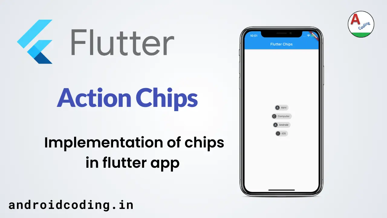
Output :
This screen depicts the usage and implementation of the flutter chips
